
Caregiver decision guide
How to Protect Your Parent From Online Dark Patterns
Dark patterns are engineered interface choices — disguised ads, hard-to-cancel subscriptions, buried terms, and data-harvesting tricks — that older adults often recognize least when the harm is hidden or delayed. Caregivers can learn to identify the most common forms, hand a parent a one-line fix for each, and recognize when it is time to take over account oversight.
The problem usually does not arrive looking like a crisis. A parent clicks what appears to be a normal article, accepts a “free” trial, or taps the large green button because the small gray alternative looks like it is not meant to be used. Two weeks later there is a renewal charge. A month later the inbox is full of offers. The privacy setting that mattered was not the one they thought they chose.
That is why the useful question is how to give a parent a short enough rule to use while the screen is pressuring them. “Be careful” disappears the moment a page adds a timer, a bright recommended choice, a buried cancel link, or a friendly sentence that makes data sharing sound harmless.

Start by naming the design, not blaming the click
The Federal Trade Commission groups dark-pattern tactics into four broad kinds: ads that look like independent content, subscription traps that make cancellation hard, buried terms or junk fees, and design tricks that push people to give up data they otherwise might protect. [1]
Those are not rare edge cases. In a review of 642 subscription websites and apps conducted in January and February 2024, the FTC, ICPEN, and GPEN reported that nearly 76% used at least one possible dark pattern and nearly 67% used more than one. The most common were “sneaking,” where important information is hidden or delayed, and “interface interference,” where the screen layout steers the choice. [2]
| What the screen does | What your parent can call it | Short fix to teach |
|---|---|---|
| Makes an ad look like an article, review, warning, or search result | Disguised ad | If it sells, signs you up, or asks for payment, treat it as an ad. |
| Makes “accept,” “continue,” or “recommended” large and easy while hiding the safer choice | Steered choice | Find the small option before touching the big one. |
| Preselects data sharing, add-ons, renewals, or marketing permissions | Pre-ticked box | Untick first, then decide. |
| Promises a free trial but makes the renewal date or cancellation route hard to find | Trial trap | No free trial unless you know the cancel date and cancel path. |
| Shows the real cost, fee, term, or privacy consequence late | Hidden cost | Do not finish until the final page matches what you expected. |
The point of naming is not to turn your parent into a web designer. It is to slow the moment down. Once a parent can say, “This is a hidden cost,” or “This is a pre-ticked box,” the screen loses some of its authority.
A field guide to the dark patterns that hook older users
One ACM study of older adults’ perceptions found that older adults were especially troubled by hidden-information patterns and by patterns with long-term financial or privacy consequences. [3] That finding fits what families often see at home: the visible click looks small, while the real consequence arrives later.
A 2026 study of 408 adults age 60 and older linked perceived dark-pattern exposure in online shopping with cognitive overload, decision fatigue, and trust bias, while also finding that digital literacy moderated those effects. [4] A separate 2023 experiment found that older adults expressed higher privacy concern than younger adults, yet still disclosed more under opt-out defaults and positive framing. [5] That is the part worth taking seriously: concern is not the same as protection when the default has already been chosen for them.
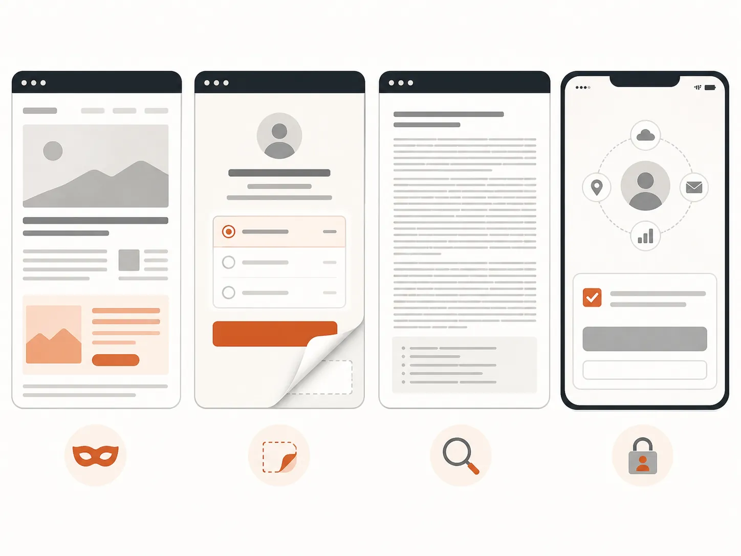
1. Disguised ads that look like help
On screen, this may look like a health article, a product ranking, a computer warning, a “sponsored” search result, or a download button placed beside the real one. The page borrows the shape of advice, news, or customer support, then sends the person toward a purchase, subscription, or data form.
It works because the parent is not deciding, “Should I trust an ad?” They think they are reading instructions or following a normal next step. If they are already worried about a device problem, medication question, travel booking, or account notice, the ad gets to wear the costume of assistance.
Parent-facing rule: If a page asks for money, a card, a phone number, or a login, stop treating it like an article and start treating it like an ad.
2. The big bright button and the tiny escape
This is the layout where one choice is large, colored, centered, and labeled with a pleasant word such as “continue,” while the other choice is small, pale, pushed to a corner, or phrased awkwardly. The safer option may be “skip,” “not now,” “manage choices,” or a plain X that is hard to see.
The pressure is visual before it is logical. A tired person does not compare every option equally; they follow the path the screen has made easiest. Dark-pattern catalogs often describe this kind of steering as interface interference or visual manipulation, because the layout itself changes the decision. [6][7]
Parent-facing rule: Before touching the largest button, look for the smallest option on the screen.
3. Pre-ticked boxes and opt-out defaults
A pre-ticked box may enroll someone in emails, allow partner data sharing, add a warranty, accept tracking, or choose automatic renewal. Sometimes the box is visible but placed near the bottom. Sometimes the safer choice is hidden behind “customize,” “more options,” or “manage preferences.”
This pattern is especially unfair because it turns silence into consent. A parent may care deeply about privacy and still miss the place where the decision was already made. Positive framing makes it worse: “Help us improve your experience” sounds cooperative, not like permission to collect or share more information.
Parent-facing rule: Untick anything that is already checked, then choose only what you actually want.
4. “Free” trials that are really renewal tests
The screen says the trial is free, but the card is required now. The renewal date is in small print, the monthly or annual price is lower on the page, and cancellation instructions are somewhere else entirely. The parent experiences the offer today; the cost is scheduled for later.
This is one of the places where ordinary caution fails. A parent can read the word “free” correctly and still not see the future charge. The risk is not only the first payment. It is the family time spent finding the account, locating the renewal, resetting the password, and proving the subscription was not wanted.
Parent-facing rule: No free trial unless you can point to the renewal date, the price after the trial, and the cancellation button.
5. Hidden fees, buried terms, and late surprises
The first price looks acceptable. Then, near checkout, a service fee, processing fee, shipping charge, protection plan, or required add-on appears. In privacy settings, the equivalent is a consequence disclosed only after the parent has already invested time in the process.
The design takes advantage of momentum. Once someone has chosen the product, entered an address, created an account, or typed payment information, backing out feels like losing the effort already spent. For an older adult who finds forms tiring, that fatigue is part of the pressure.
Parent-facing rule: The last page must match the first price you agreed to; if it changed, stop.
6. Hard-to-cancel subscriptions
Signing up takes one or two taps. Canceling requires a login the parent no longer remembers, a chat window that pushes discounts, a phone call during business hours, or several screens that keep asking, “Are you sure?” The cancel option may be hidden under billing, account, membership, plan, or support.
This pattern punishes the person who is least likely to enjoy account archaeology. It also punishes the family member who later has to reconstruct what happened from credit-card lines and old emails. A parent may not even know the subscription still exists until a renewal appears.
Parent-facing rule: If signing up is easy but canceling is hard to find, ask for help before entering a card.
7. Countdown timers and scarcity warnings
A timer counts down. A banner says the deal is ending soon. A page claims that only a few items, rooms, appointments, or discounts remain. Some warnings may describe real limits; others are used to make a routine decision feel urgent. The OECD includes scarcity messages among common dark-pattern techniques in online shopping. [6]
Urgency shrinks the time available to notice everything else: the renewal term, the shipping charge, the preselected add-on, the data permission. It is not a coincidence that countdowns often sit near the payment step.
Parent-facing rule: A timer means close the page, not hurry.
8. Guilt language and fake reassurance
Some screens make the safer choice sound foolish or selfish: “No thanks, I do not want protection,” “I prefer to miss savings,” or “I do not care about improving my experience.” Others use soft reassurance: “recommended,” “trusted,” “smart choice,” or “most people select this.” The Nielsen Norman Group’s deceptive-pattern catalog includes tactics such as confirmshaming and social proof that use wording or popularity cues to steer a choice. [7]
This can work on anyone, but it has a particular bite when a parent is trying to be competent and independent online. The screen makes refusal feel like a mistake. A caregiver’s job is to make refusal ordinary again.
Parent-facing rule: If the “no” option insults you, choose no.
Teach the pause as a habit, not a lecture
The best teaching moment is not a scolding after the charge appears. It is a short, repeatable pause before the next click. Sit together with a harmless example if you can: an old promotional email, an app settings page, or a shopping cart you do not intend to complete.
- Ask what the screen wants them to do first. The largest button is usually the clue.
- Ask what happens later. Renewal dates, data sharing, and cancellation rules are often delayed consequences.
- Ask where the smaller option is. “Skip,” “not now,” “manage choices,” and “continue without” are often the real exits.
- Ask whether anything is already chosen. Pre-ticked boxes should be treated as decisions made by the company, not by the parent.
- Ask whether the parent would still choose it without the timer, guilt wording, or “recommended” label.
Keep the language plain. “They hid the price” is easier to remember than “sneaking.” “The big button is steering you” is more useful than “interface interference.” The formal names matter for caregivers; the home version should be short enough to use mid-click.
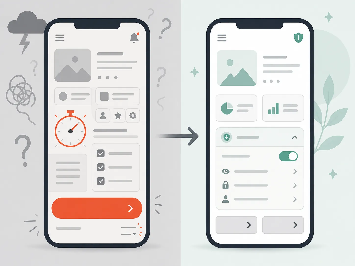
When identification is enough — and when it is not
Identification is enough when your parent can pause, name the pattern, and apply the fix without you taking over. If they can say, “That is a timer, so I am closing it,” or “That box was already checked, so I am unticking it,” the goal is not to remove their independence. The goal is to make the online environment less one-sided.
Move from teaching to account oversight when the consequence is hidden, delayed, repeated, financial, or hard to reverse. The FTC reported that fraud losses reported by adults 60 and older rose from roughly $600 million in 2020 to roughly $2.4 billion in 2024, while also noting that reported losses do not capture the full scale of harm. [8] Dark patterns are not the same thing as all fraud, but delayed charges, obstructed cancellation, and data-sharing defaults belong in the same practical family for caregivers: harms that may not be visible at the moment of the click.
The threshold is not “my parent made one mistake.” The threshold is that the design keeps winning after the pattern has been explained, or the cost of being wrong is too high to leave to vigilance alone.
Use oversight for recurring money
Subscriptions, renewals, app-store purchases, memberships, and free trials should have a second set of eyes if your parent has trouble finding cancellation paths or remembering renewal dates. A shared renewal calendar, monthly card review, or agreement that new trials require a quick text before signup can preserve choice while reducing cleanup.
If your family is already deciding how much technology oversight is appropriate, use the same privacy-and-independence lens you would use for home monitoring. A broader elderly monitoring system decision framework can help separate light-touch support from more direct supervision.
Use oversight when cancellation is obstructed
A parent should not have to fight a company’s cancellation maze alone. If canceling requires a phone call, repeated retention offers, buried account menus, or password recovery, sit with them and complete it together. Save confirmation numbers, cancellation emails, screenshots, and dates in one place.
If the same company continues billing after cancellation, move the task out of the teaching category. That is now a dispute, card-monitoring, or account-replacement problem, not a “try to be more careful next time” problem.
Use oversight for privacy choices that are hard to undo
Some privacy choices are low stakes. Others share location, contacts, health-related interests, shopping behavior, or personal identifiers with systems the parent cannot see. If a setting is buried behind “manage partners,” “personalization,” “ad preferences,” or “data sharing,” review it together rather than asking your parent to decode every label alone.
The conversation matters. “Let’s make this match what you want” lands differently than “You should not be doing this yourself.” If resistance comes up, the same no-blame approach used when a parent rejects safety changes after a health event can help; the useful frame is doing the task with your parent, not doing it to them. For a related conversation model, see why parents resist fall-prevention changes and what works instead.
Use oversight when the same pattern keeps winning
One mistaken click is information. Repeated trial charges, repeated data-sharing opt-ins, repeated fake support pages, or repeated difficulty finding the real cancel button are a pattern of their own. At that point, the family should stop relying on memory and willpower.
- Review subscriptions and app-store purchases on a set day each month.
- Turn on transaction alerts for cards used online.
- Keep a shared list of active subscriptions, renewal dates, and cancellation links.
- Use a separate low-limit card or payment method for trials if your parent still wants to try services.
- Review major privacy settings together after app installs, device changes, or account resets.
The practical stopping point is simple: teach the name when the parent can still choose; add oversight when the screen hides the consequence, delays the cost, blocks the exit, or keeps beating the same person after they understood the rule.
References
- Bringing Dark Patterns to Light, Federal Trade Commission, September 2022.
- FTC, ICPEN, GPEN Announce Results of Review of Use of Dark Patterns Affecting Subscription Services, Privacy, Federal Trade Commission, July 2024.
- Towards an Understanding of Older Adults' Perceptions of Dark Patterns, ACM, 2024.
- Choices under manipulation: Cognitive processes and behavioral biases of older adults under perceived exposure to dark patterns in online shopping, deceptive.design, 2026.
- Older and Younger Adults are Influenced Differently by Dark Pattern Designs, Hackernoon, 2023.
- Six dark patterns used to manipulate you when shopping online, OECD, September 2024.
- Deceptive Patterns, Nielsen Norman Group.
- Protecting Older Consumers 2024-2025, Federal Trade Commission.
Questions to bring to a clinician or OT
This is not medical, legal, or a family's final decision — only a framework. Bring these questions to a clinician, occupational therapist, or your local Area Agency on Aging.
Find Local HelpRelated reading
Noticed something outdated or inaccurate on this page? Flag a correction. We review every report against CDC, NIA, and AARP HomeFit guidance before updating a page.